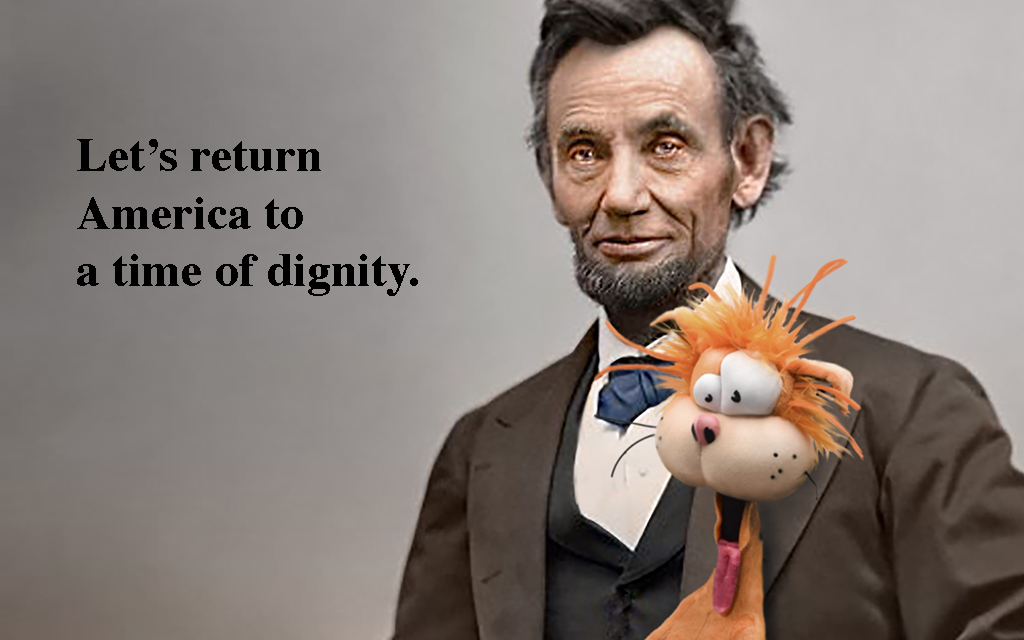
Oooh! Type font wars! Who knew graphic design could be so cutthroat?Herbert Helvetica seeks to squelch the “2 spaces 4 U” movement with money, which is usually pretty effective, before switching to more “direct” tactics (direct=lethal)….
According to Science Fiction movie in the 70s, in the future now we’re all suppose to be using computer friendly type face like is on paper checks- the letters and numbers with little flags on them
As one who knows the real difference between upper and lower case and was hand setting type with a nut between words and a monkey after the period more than 60 years ago, I prefer Caslon or Times Roman.
I was learning computer stuff, back in the early ’90s.I was listening to a couple of engineers discussing fonts. I think they had a new program of different fonts.One turned to me and shared his wisdom and knowledge by informing me that “fonts” were the different computer letters.I said, “Yeah, fonts have been around since Gutenberg.”My reply got a quizzical look.
Times Roman is my favorite, it’s easy to read. I have had books printed in strange ‘artistic’ fonts that were hard to read. A local large newspaper changed to a strange font a few years ago. Just another milestone on that newspapers road to oblivion.
Anyway, I was wrong. English used the term ’ a casting’ about 1570, then ‘font, or fount’. Oh, its from Middle French, fonte," a casting", the noun use of the fem. past particple of “fondre”, to melt.
Of course I had to look it up. Nobody knows this kinda stuff. I loves GO comics.
I always wondered why the country sign for Switzerland was CH. Mystery solved when I saw my first Swiss franc: Confederatio Helvetica. Helvetic Confederation, in Latin, so as not to ruffle any German, French, Italian or Romansch feathers.
If I were President, my first executive order would be that all documents would be in Comic Sans. To drive out all the clowns who think things like that matter, and relegate them to changing cat boxes where they belong.
I didn’t know that Font Fanatics like myself existed! I thought I was all alone in the world, longing for the days of clarity that two spaces bring. And now here it is. I pledge myself to The Cause.
Had a classmate at RISD back in 1959, who won an award designing a type face/font. All letters were hand drawn very large. Critical line thickness/weight balance essential to legibility when reduced to 10pt size. My favorite typeface was Grotesk. Great for captions, but took up too much space in body copy. Hand setting Arttype & similar self adhesive type products, for advertising presentations, [before photo set type or computers, took a critical eye to get spacing correct.
Spacing between sentences another nightmare issue.


Jonathan K. and the Elusive Dream Girl about 9 years ago
Herbert Whoover? (Sorry… I couldn’t resist.)
Sherlock Watson about 9 years ago
He’s trying to hire Opus to “take out” Franklin Gothic.
unclebob53703 Premium Member about 9 years ago
Ooooo, there’s going to be helvetica to pay
Sisyphos about 9 years ago
Oooh! Type font wars! Who knew graphic design could be so cutthroat?Herbert Helvetica seeks to squelch the “2 spaces 4 U” movement with money, which is usually pretty effective, before switching to more “direct” tactics (direct=lethal)….
archipelago Premium Member about 9 years ago
No, not a sans-serif typeface!
SkyFisher about 9 years ago
Odd, he speaks in Comic Sans.
billsarar about 9 years ago
According to Science Fiction movie in the 70s, in the future now we’re all suppose to be using computer friendly type face like is on paper checks- the letters and numbers with little flags on them
snailgate about 9 years ago
As one who knows the real difference between upper and lower case and was hand setting type with a nut between words and a monkey after the period more than 60 years ago, I prefer Caslon or Times Roman.
A Hip loving Canadian... about 9 years ago
This is not good… today two space between sentences, tomorrow, maximum font size. When/where will this end?
Tandembuzz about 9 years ago
Give me Lombardic any day of the week…twice on Sundays!
Old Texan75 about 9 years ago
I was learning computer stuff, back in the early ’90s.I was listening to a couple of engineers discussing fonts. I think they had a new program of different fonts.One turned to me and shared his wisdom and knowledge by informing me that “fonts” were the different computer letters.I said, “Yeah, fonts have been around since Gutenberg.”My reply got a quizzical look.
Times Roman is my favorite, it’s easy to read. I have had books printed in strange ‘artistic’ fonts that were hard to read. A local large newspaper changed to a strange font a few years ago. Just another milestone on that newspapers road to oblivion.
Anyway, I was wrong. English used the term ’ a casting’ about 1570, then ‘font, or fount’. Oh, its from Middle French, fonte," a casting", the noun use of the fem. past particple of “fondre”, to melt.
Of course I had to look it up. Nobody knows this kinda stuff. I loves GO comics.
dutchs about 9 years ago
I always wondered why the country sign for Switzerland was CH. Mystery solved when I saw my first Swiss franc: Confederatio Helvetica. Helvetic Confederation, in Latin, so as not to ruffle any German, French, Italian or Romansch feathers.
dutchs about 9 years ago
If I were President, my first executive order would be that all documents would be in Comic Sans. To drive out all the clowns who think things like that matter, and relegate them to changing cat boxes where they belong.
JEParsons about 9 years ago
There’s nothing Neue under the sun.
Susanlee3 about 9 years ago
I didn’t know that Font Fanatics like myself existed! I thought I was all alone in the world, longing for the days of clarity that two spaces bring. And now here it is. I pledge myself to The Cause.
Rolf Rykken Premium Member about 9 years ago
All these comments are so funny — funnier than the strip? No, just kidding.
finnygirl Premium Member about 9 years ago
LOL!
Banjo Gordy Premium Member about 9 years ago
Had a classmate at RISD back in 1959, who won an award designing a type face/font. All letters were hand drawn very large. Critical line thickness/weight balance essential to legibility when reduced to 10pt size. My favorite typeface was Grotesk. Great for captions, but took up too much space in body copy. Hand setting Arttype & similar self adhesive type products, for advertising presentations, [before photo set type or computers, took a critical eye to get spacing correct.
Spacing between sentences another nightmare issue.