GoComics Update: New Engagement And Navigation Enhancements
by The GoComics TeamGoComics just got a little more social and a lot easier to navigate.
Based on your post-launch feedback, we've made engagement effortless. It's easier than ever to like, comment on, share, and subscribe to your favorite series. What's more, we removed some redundant design components to streamline comic navigation and deliver more optimized sizing on desktop and mobile devices. The comics remain the same size, we've simply enhanced reading, navigating and engaging with them.
Here's a quick rundown of what's changed:
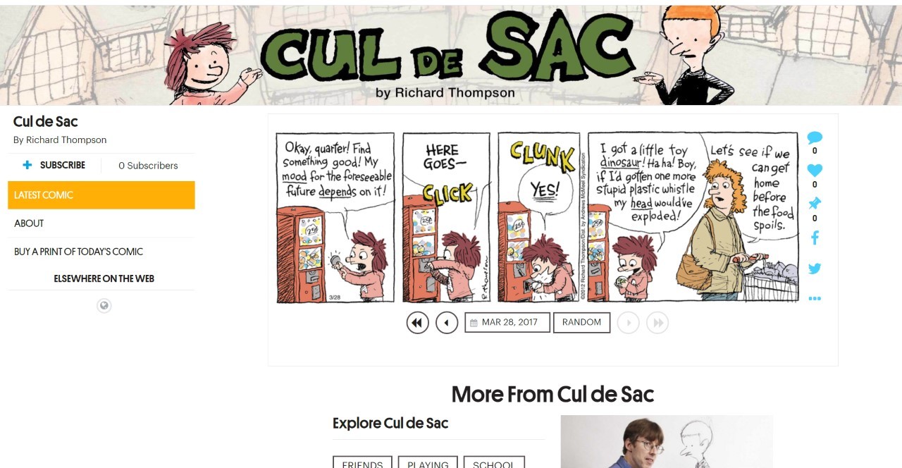
New Left Sidebar: To the left of each comic strip you can find a new hub where you can subscribe to a series or find out more about its creator and cast of characters. Ever curious to see how many fellow GC users are subscribing to a title? The totals now update in real time.
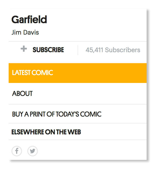
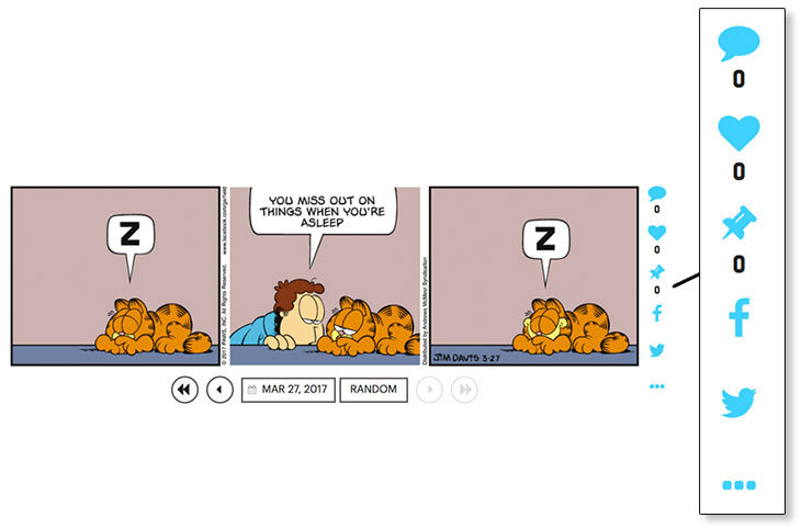
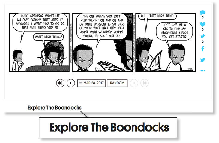
New Engagement Bar: New buttons appear in a right-hand rail alongside every comic where users can click to comment, like, favorite, or share a comic on their preferred social channels.
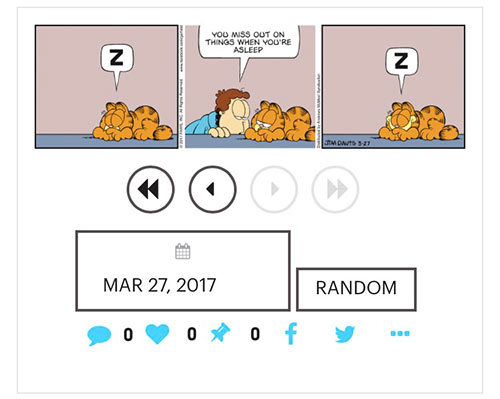
New Navigation Placement: We've moved the navigation arrows and calendar search to the bottom of each comic, making it easier to hop around GoComics after reading longer-form or vertical-oriented strips.
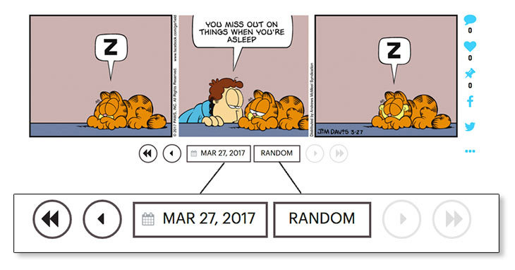
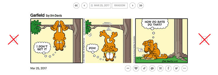
Cleaner Navigation Interface: We got rid of the redundant side arrows that previously framed each comic on the left and right.
Mobile Matters: The calendar navigation tool and "Random" button are now available on the GoComics mobile experience, bringing the popular desktop tools to your phone, tablet and other mobile devices.
Comment Preview Option: Each comic now displays a preview of the most-engaged or most recent comment on a given comic to spur more conversations in the GoComics community.
More Is More: Interested in more from your favorite creators? Beneath every comic we point to relevant bonus goodness.
That's all for now. Stay tuned for even more GoComics updates!



BiggerNate91 over 7 years ago
Looks good, but the “most engaged/recent comment” I could probably do without.
Elisabunny over 7 years ago
The left sidebar might be useful, but its size and placement are terrible. Bring back the larger comics!
planeman over 7 years ago
Having to expand every panel is a pain in the backside. Get rid of that and just have the whole panel on the page. Scrolling is easy if needed.
planeman over 7 years ago
Many of the comics opened with a facade page with large “Go Comics” graphic and had to be reloaded. It was things like the above mentioned having to click expand and bad loading that got me here from a different comic aggregation site. A couple more days like this and I will be looking to see if they have cleaned up their act.
pam Miner over 7 years ago
I am on my iPad and don’t know if this update is on this. How can I find out?
JPuzzleWhiz over 7 years ago
I have some questions:
1. Will we be able to post images like we used to before last summer?
2. Will we be able to post live links like we used to before last summer?
We sure would like to!
JPuzzleWhiz over 7 years ago
Oh, and one last question:
How can we expand a comic’s view if we need to?
JPuzzleWhiz over 7 years ago
“GoComics, we have a problem…”
The problem being this:
If you try to click the “Reply” link on a post that’s a reply to another poster, the link does not work. Also, the “delete” icon has much too long of a lag time.
Night-Gaunt49[Bozo is Boffo] over 7 years ago
I would prefer that when we go to the comic and comments that all comments open automatically. Right now if I want to open several replies under comments I get pulled to the bottom open one of the first one I clicked on. Adds to the hassle. Also some comics were already still too small to read so the crunch to the side just makes it worse, not better. Maybe you could have polled us first before making these changes. Did you know that Japanese car makers would ask customers what they liked and wanted and from the numbers made those changes. It would be easier for you and us if you asked. But you do so now so here we are. Thank you for asking us.
Change isn’t always necessary if it is already working.
Night-Gaunt49[Bozo is Boffo] over 7 years ago
Oh and that persistent link malfunction continues randomly. After a certain number of responses under a comment is made the link though the icon changes to active, will not open. Found three yesterday.
Terminal Frost Premium Member over 7 years ago
as you scroll down, the left hand side of the screen wastes too much space.
katina.cooper over 7 years ago
I have a comment that is a little related to the new format. When will Sherpa be brought back so we can make comments on those comics. Many of the cartoonists have stopped drawing their cartoons. Is there a time in the future when they will return?
up2trixx over 7 years ago
I’d like to see my comics list only show updated comics. I mean, I like Foxtrot, but I don’t need to see the same strip every day. When I read one of the comics in my list and click next, I’d like to see the “next” one be the next updated one. I mean, I like Foxtrot, but I don’t need to see the same strip every day.
birdface over 7 years ago
When I click to read comments the new version takes us into the reply box automatically. It skips to the bottom of the comments and causes me to have to exit from the reply box and page back up to read the comments. I prefer to read the comments first then decide to comment later. This is very frustrating and definitely not user friendly.
michaels11 over 7 years ago
Three problems. I miss Sherpa. I miss being able to divide up my favorites into separate groups (each comic gets its own group). I wish when there is a problem such as a comic stop downloading for a long time that someone working at this site joins the comments and answers our questions.
Sisyphos over 7 years ago
Comics did not “remain the same size.” They are now all smaller, to accommodate your Left Sidebar, with no means of enlargement. And the Left Sidebar eats up one-third of the page all the way down, too, beside the scrunched-up Comments, with nothing in it.
Geekdad over 7 years ago
PLEASE get rid of the Expand bar at the bottom of some cartoons. It’s worse after the update today and inconsistent in the what size images you have to expand. It’s very annoying to have to expand these. It most take less coding to just show the whole image.
Clobbered by Science Premium Member over 7 years ago
.
“The comics remain the same size”
Not true.
In order to make the left sidebar, the comic, and the engagement bar all fit the same horizontal space, the comic is shrunk down. To get a full-sized comic, I have to widen the browser window until it’s wider than my monitor.
The left sidebar takes up way too much room. I come to the website to see comics, not navigation bars. Put the comics at the top at full size, and if I need a navigation bar, I’m just fine with scrolling to get to it.
22ph over 7 years ago
I am just glad I have Neil’s tools to make my life here bearable.
William LaMar Premium Member over 7 years ago
1) There was nothing wrong with the old pages. It worked just fine, why change???? 2) Ever since this change from the old system, I haven’t been able to read my comics back to the date that I was up to (11/1/87), without opening each comic individually and clicking back to the date I want to continue at. I don’t have 16 hours a day to keep flipping back an forth. I want it like it was go to a date and read all the comics for that one date, click the arrow and move on to the next day. Did anyone actually stop to think about they were doing before they did it? The total lack of planning before the roll out was ridiculous. So because I don’t have the time that you seem to think I do, I am getting ripped off here. Please either go back to the old system that everyone was happy with, or get this one fixed. I don’t like not getting what I am paying for.
Bob. over 7 years ago
Many times the “comments” will not open.
Diat60 over 7 years ago
I miss being able to go through the A-Z listings by just clicking the “next” arrow. Now the only way to see each strip sequentially is by going back to the listings every time. That gets old really really fast!
mikeg52 over 7 years ago
I understand why some comics need the “Expand” button (Doonesbury, Shutterbug Follies) , what I don’t understand is why a one panel strip (9 to 5, Clay Jones) need it. Can someone explain that ???
dtrim over 7 years ago
Please bring back the ability to delete a comic from a MyComics list while we are viewing it.
You used to not only have an engagement bar for each comic you also provided link that would delete the comic from your list.
The Brooklyn Accent Premium Member over 7 years ago
I’m still trying to figure out why I am unable to get anything other than “COMICS COM” to show up as my ID when I comment.
Neil Wick over 7 years ago
If I click on “13 replies” I want to read those replies, not scroll down to the comment box below them. If if I do want to add my reply, I want to read the others first to make sure that I’m not duplicating them.
cknoblo Premium Member over 7 years ago
I used to be able to reorder my comics easily. Now, it looks like I can, but when I try, it just messes up my order. Every time I try to fix it, it gets worse. Finding the “save” button is just the worst of the problems.
Joseph Nebus Premium Member over 7 years ago
So, I only discovered this with the announcement of the new ``Cheer Up, Emojifies Kid’’ comic strip this week, but apparently there’s no longer the button for adding a comic to my comics page. This seems like a poor design choice if you’re interested in getting people to sample a comic and add a new one. Any plans on fixing that?
katina.cooper over 7 years ago
Will there be a time when we can start commenting on Sherpa? A lot of the cartoonists are leaving. Or, better yet, how about just putting all of them in the main section? It shouldn’t be that hard to do.
katina.cooper over 7 years ago
A month has passed. Still nothing about Sherpa being able to accept comments. Maybe in another month.
katina.cooper over 7 years ago
Even after the update, still no magnifier.
katina.cooper over 7 years ago
Been over three weeks and still no sherpa or magnifier. Maybe next month.
katina.cooper over 7 years ago
Well, it’s next month. Still no magnifier and no sherpa on the main page.
katina.cooper over 7 years ago
Nobody here at Gocomics even reads this blog. Cartoonists from Sherpa are leaving. Before long, there won’t be anybody on that section. When that happens, I’ll also be gone. Hopefully, everybody else will also leave. Then, the message will be sent.
katina.cooper over 7 years ago
Now this is down on page 7. How much longer do we have to wait for sherpa to get put back where it should be? Is anybody out there or are you all doing drugs while at work?
katina.cooper over 7 years ago
I guess nobody works here. It’s nothing but a computer, just as I thought it was.
katina.cooper over 7 years ago
You know what, there is nothing but a computer here. I’ll bet the main place is somewhere in China and it’s run by Russians.