Navigation Changes: Everything You Need To Know About The New Nav
by The GoComics TeamMeet the new and improved navigation bar.
The new navigation bar prioritizes comic discovery on the left and user functions on the right. It also adds onsite notifications, which alert registered users to their comment activity. To make both sections easier to use, we've revised what some functions are called. We think you're going to dig the changes.
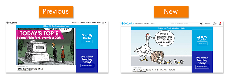
Previous Layout vs. New Layout
While the previous navigation bar sat on the right side of the screen, the new navigation bar shifts discovery functions to the left and user functions to the right. Unregistered users will see an option to sign up for an account on the right, while registered and premium users who have signed in will see their account options and notification alerts.
Comic Discovery
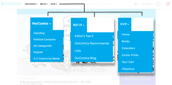
The discovery portion of the new navigation bar is divided into three drop-down menus; Find Comics, Best Of, and Shop. These replace the previous Comics, Blog, and Shop buttons.
Find Comics
Check out trending comics, read the latest political cartoons, search comics by category, see what's popular, and view all GC titles in alphabetical order.
Best Of
Here you'll find a link to our daily Editor's Top 5 picks, the GoComics Recommends section, the new Lists section (previously known as "Collections"), and the GoComics Blog.
Shop
The Shop button continues to take you to your favorite items straight from the GoComics homepage.
User Section
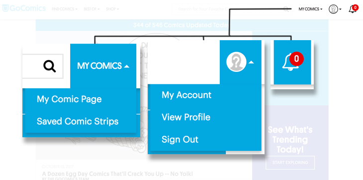
The User Section makes it easy to use and manage your account via the My Comics button, an avatar button, and a notifications button.
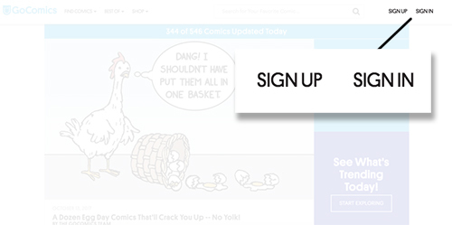
If you haven't signed in or don't have an account, the navigation will display the Sign Up and Sign In buttons. Unregistered users can sign up for a free or premium account via the Sign Up button.
My Comics
Free and premium users can now find all of their content under the My Comics button.
My Comics Page
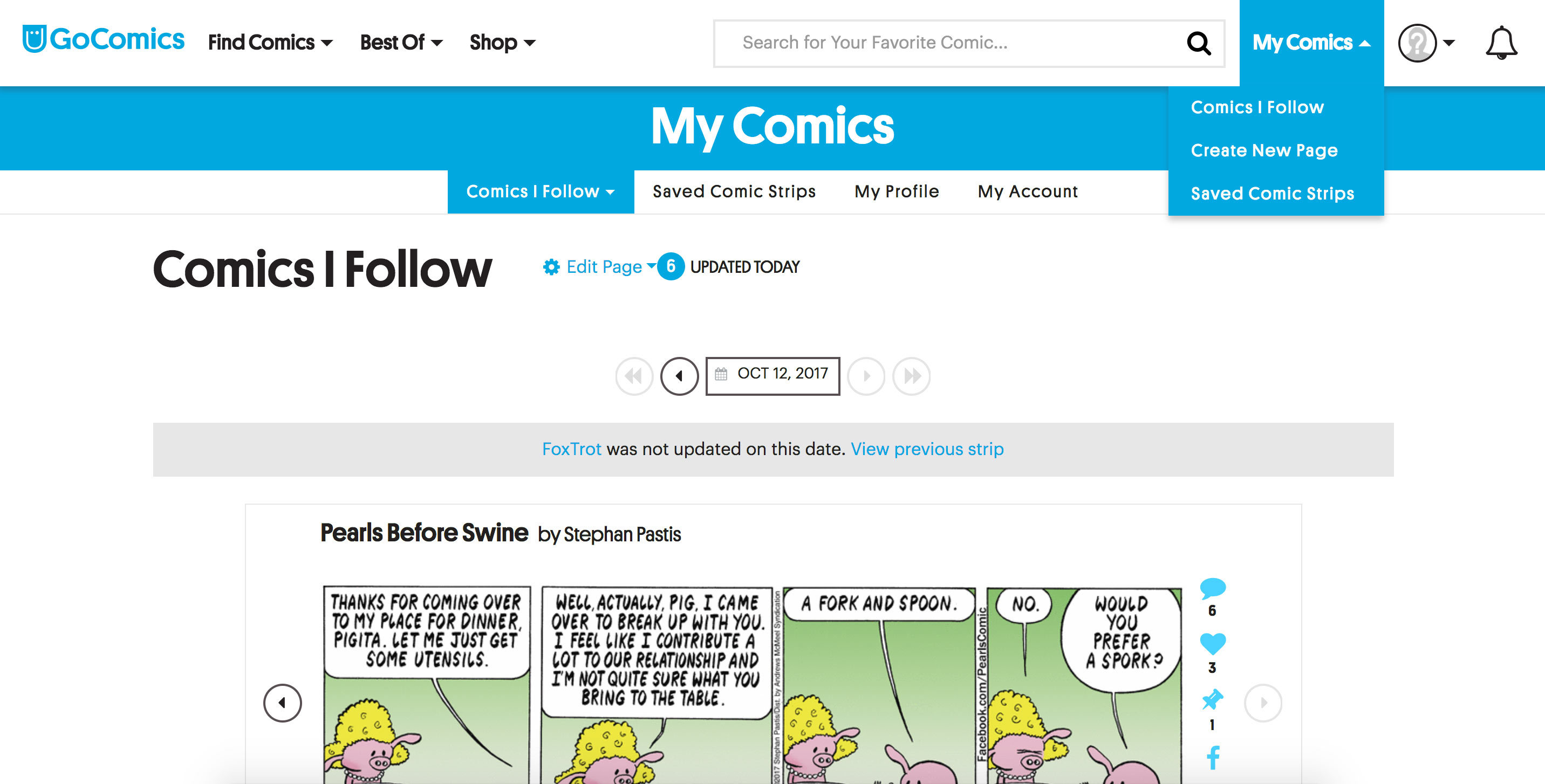
The My Comics Page site is where you can find all of the comics you have subscribed to under the Comics I Follow tab. You can also find your Saved Comic Strips, edit your profile, and make changes to your account.
Comics I Follow
Following comics puts each of their latest installments in one place, the Comics I Follow page. You can add comics as you browse by clicking "Subscribe". While on the Comics I Follow page, you can add comics by clicking "Edit Page" to browse the GoComics content list and clicking the plus icon next to the comics you would like to add.
To remove selections, use the "Edit Page" link on your My Comics page, or click on the "Unfollow This Comic" button on any comics page.
Your My Comics page displays selections in the order that you made them by default. From the top of your My Comics list, click "Edit Page" to re-order your comics.
Saved Comic Strips
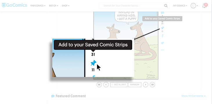
The Saved Comic Strips page contains all of the comics that were previously called Favorites. Picking a comic you'd like to save has not changed, however. Click the thumbtack icon next to a comic to save it.
My Account
Clicking your user avatar will give you the option to view your account information, view your user profile, or simply sign out.
Notifications
The Notifications button displays an alert each time someone likes or replies to one of your comments. Notifications can be excused all at once, or one at a time.
Enjoy the navigation updates and remember to read comics every day!



Happy, happy, happy!!! Premium Member about 7 years ago
I like the fact that the older comics are bigger now, and that all the comics are bigger, but i wish that you would fix *Sherpa*>
I had, before you changed everything, several Sherpa comics in my queue.
The way things are now, it’s too much trouble to go looking for them. I just don’t have time to screw with that. Possibly because mu queue is so long, but still…
I also don’t think that its very fair to the artists in sherpa that there is no way for people to comment. If i could comment on Sherpa comics i would probably put in more effort to look at them.
Please, bring Sherpa up to speed.
Thank you.
shaunnmunn about 7 years ago
Don’t like that ANNOYING white bar (with the three bars on the left, "GoComics in the center, & magnifying glass on the right). It keeps dropping down & popping back up again & again. VERY distracting! And why can’t I scroll the “likes” anymore? it is frozen & I can’t see more than the first 5 likes. Please give us the option to X out the white bar & give us back our ability to scroll “likes”. PLEASE! PLEASE! PLEASE! PLEASE!
Dirty Dragon about 7 years ago
The last few days, I’ve been wondering what happened to the (blue) comment, like and favorite buttons to the right of each comic. Totally vanished for me (and just checked, still not there).
All I can do is leave a comment – only AFTER someone else comments so the comments section shows up at the bottom of the page.
shaunnmunn about 7 years ago
What the dingetydongding is going on?!? I’m usually a pretty laid-back old gal, but I STILL CAN’T SCROLL THE LIKES! AND I HATE THAT WHITE BAR AT THE TOP! What genius thought we’d like a big space-wasting distraction that pops down & up like a yo-yo??? Goin’ to bed. Hope things are back to normal tomorrow. :-{{{{{{{{{{{
rayfinfer about 7 years ago
What the hell happened to my comics? They are so small I cannot read them at all……
Gent about 7 years ago
Nice changes and improvements to the site! I like it! Thank you, Go Comics :)
ceren Premium Member about 7 years ago
I used to save the comics I like to my PC. Now I cant do it anymore. I hate this!!! If I am a paying users then I should be able to save the comic I like.
Gent about 7 years ago
There are two more improvements I’d really like to see here.
1. The ability to zoom a comic with a zoom in button, especially on a mobile device. When I try to zoom in by dragging with the fingers, it sometimes drags the comic left or right, and it ends up going to the previous/next day’s comic.
2. Uh.. I forget what the second one was. However, is there a way to send this feedback? Like, a contact us page or a support email?
Proxima Premium Member about 7 years ago
Sorry, but I hate the new layout. The code is NOT compatible with older devices with older browsers (that cannot be upgraded without buying an entirely new device.) The app doesn’t have the same functionality as the web-page, and the new design has rendered the web-page unusable. I’m using an old iPad, with an equally old version of Safari. Up until today, it worked just fine; now the comic pages are broken: huge white spaces to the left, TINY little squashed comic buried somewhere to the right if you scroll over. Sorry, but this “upgrade” is anything but. When the old system worked just fine, making it “new and improved” just broke something that didn’t need fixing in the first place.
cuteswan Premium Member about 7 years ago
So, you keep making everything about your own layout enormous – so that we have to scroll like crazy to see our comics – but you’re still shrinking the comics themselves so that even on large screens they’re difficult to read? (Otherwise we could just zoom out so that your layout is less obnoxious.) When are you going to realize that we come here for the comics, not mediocre web design?
zipper132 about 7 years ago
The only person I know that likes change is a BABY !!
Jeremy Hendricks about 7 years ago
Where do we find the recently/newly added comic strips now?
"I can't take it anymore"" Premium Member about 7 years ago
Can you make the blue banner smaller with a smaller font. And does the “Your Name Comic Page” font have to be so big? The header section on the page take up half of my screen.
Bozoid the Magnificent Premium Member about 7 years ago
The new layout wastes way too much space on ‘branding’ and ‘new comics discovery’. I subscribe, and visit every day, to read my favorites, not to see the same recommendations over and over. And the huge, glaringly white, persistent header is annoying.
nz4m60 about 7 years ago
It stinks! (Paying subscriber since day one)
Larry_Olsen about 7 years ago
What happened to the ability to copy a comic to your own machine? Day one and I already hate the site!
weredeer46 about 7 years ago
Like it much betteer than it has been for the last few weeks, more in line now with the way it was before that. Good work.
mike75035 about 7 years ago
I think you need to look at the user section again, especially under the “My Comics” button.
newyorkslim about 7 years ago
I’m just looking for my comics. I’ve hit “my comics” and come up with… well info… but not my comics. Ugh.
KatP Premium Member about 7 years ago
So collections will never be returning? It was a lot easier saving comics into groups than just dumping them all together. Ugh.
Seeker149 Premium Member about 7 years ago
Ditto to KATP. We were assured a year ago that our collections would be saved and eventually restored. I’d be slightly less annoyed if someone would give us an update, EVEN if it was to tell us “sorry, never mind.”
TheBrownStarfish about 7 years ago
In the comments section, it would be nice to have an edit button in case you misspell something or want to add to a comment after it’s been posted.
alikgator about 7 years ago
Please, take away the persistent header! It is horrible on bith my smartphones and keeps dropping down and I can’t make it go away. It hides the half of my comic strips.
And second problem is that the strips don’t adjust themselves to the device width. What with the dropping header makes it impossible to read ANY comics. I use Firefox. If it can help.
Eric Premium Member about 7 years ago
Get rid of that blinking eye lid of a header. It is annoying and wastes screen space. It is really awful!
pbuckland Premium Member about 7 years ago
My complaints so far are 1. The white space consuming bar that gives me headaches bobbing up and down. I see nothing that I need on that bar, but it gets in the way of seeing the comics. 2. For the last few months, I was able to set my page zoom to the maximum width for the smallest comics, and the larger ones seemed to adjust to fit the screen width. Now they no longer adjust themselves, and I have to constantly scroll horizontally back and forth to read the overlap, or constantly adjust my zoom level for each comic. I have vision difficulties and need a large full screen image on my laptop.
chuckh9409 about 7 years ago
Where are the ’NEW COMICS"?
Neal Janzen Premium Member about 7 years ago
This sucks
Doug Taylor Premium Member about 7 years ago
I’m on a PC at home and work and don’t seem to be having any of the issues I’ve read about here. I love the new upgrades and have been waiting a long time for the Notification Bell. Good work GC Team!
moodymondy Premium Member about 7 years ago
This new restriction of not being able to save the comic strip has pretty well removed my reason for being a paid subscriber. My sister’s computer cannot handle this site so I save and send to her. I don’t need to pay for this because I am on the computer everyday and can read them then. Not to mention that it will not stop anyone who has windows from just clipping it. Which I could also do without paying for anything. I just happen to have a strange habit of trying to do things the right way. I guess I can just explain to her that you have removed the option of her reading it, unsubscribe, never buy any of the prints she loves from your site and just forget you exist. That looks pretty good right now.
gchrisloney about 7 years ago
Congratulations – You’ve completely taken the ‘fun’ out of ‘the funnies.’ I have no idea how any of this works and doubt I ever will. Really disappointed.
David Gerritzen Premium Member about 7 years ago
Please get rid of this oversized header! I also would like a way to enlarge some strips just by clicking on a magnifying glass and having them pop up just a little larger so they are easier to read. We had this on the old site and I would like it back. I have to use the zoom feature on my status bar and enlarge some comics up to 175% just to read them clearly. One good thing I have noticed in these changes is that the strips do seem to be slightly larger, but some are still too small to read easily.
DD IN AZ Premium Member about 7 years ago
Change just for the sake of change is not improvement.
codedaddy about 7 years ago
If I missed reading my comics yesterday I could formerly set the date to yesterday and step through them. No longer! Now I have to set the date for each comic. Is this omission deliberate? If not, please rectify.
Robert Pannett about 7 years ago
Had to submit a request for help, could not find “My Comics”, then I finally found it, as it says above: “The My Comics Page site is where you can find all of the comics you have subscribed to under the Comics I Follow tab.” Very bad decision to rename this.
Maizing about 7 years ago
I have always used the bar across the top of the page to navigate my comics. It worked well and was very convenient. That bar is no longer there with this change. Now I have to go back to the start page after every comic in order to move on to the next one. I was fine with this change until you took away my navigation bar. Please put the navigation bar back.
sadiepix about 7 years ago
I hope I am just too lost with the new layout to find what I am looking for? When I go to the “Comics I Follow” page I do see all the comics I follow as usual. I click on the first one in the queue and it comes up as usual, but then I have no way that I can see to then jump to the next one in line. I am having to go back up to “Comics I Follow”, click that again, then choose the second in line, and so on. That is an insane amount of clicking back and forth, when before there was a header so I could just pick the next one in line. I am hoping someone can tell me I am wrong and how to go about being able to just see one comic after the other. I’ll wait on some advice before getting frustrated. I really hope I don’t have to go to the drop down, pick “Comics I Follow” and THEN get to choose the next comic in line EVERY TIME. Help!
swisking about 7 years ago
Not happy with the loss of the nav bar across the top of the page. If your idea is to chase users away, I would say you have hit the nail on the head! Did someone say lets find a way to make this the most inconvenient user unfriendly site ever? Looks like a success if that was the objective.
davenace about 7 years ago
It was so easy to read My Comics when I just clicked on the subsequent icon on the bar at the top of the page. Now it appears I have to continually go to “My Comics” to get to the next comic. It’s esp. annoying when I’m on page 2 or 3. Unless I missed something, the new set-up stinks.
ulbrr2002 about 7 years ago
Because of my job I’m away for days at a time, and can’t read the ones I like on a daily basis. i liked it when you could go to the calendar, pick a date two weeks in the past, and start from there to catch up. Now I have to scroll backwards one strip at a time, and it’s annoying, and takes longer.
stapelia99 about 7 years ago
Having to go back to the ‘Comics I follow’ page in order to select the next subscribed comic to read AND having to switch to a new page every six comics has made the whole process so tedious (takes roughly 5 times as much time to read) that I actually dread coming here. Is this your intention? To constantly decrease usability until people either pay money or leave? If so, it’s working really well.
Ann Crippen Premium Member about 7 years ago
Hate the new format! Cumbersome and unwieldy! It all takes too long! It is now almost too much trouble and it no longer fits neatly into my daily routine…. add to that the fact that playing ‘catch up’ after vacation is absolutely time prohibitive. I may have to reconsider renewal when the time comes… So sad! Reading the funnies every morning was my favorite way to start the day!
alikgator about 7 years ago
nfrustrating.
alikgator about 7 years ago
nfrustrating.
Allan CB Premium Member about 7 years ago
Just go back to the comics being JPG’s and we’ll be happy … it’s not cool the way they are now.
Phypnotist about 7 years ago
I was getting Dear Abby by email. List@Myucomics.com. They stopped a few days ago. I don’t see her listed anywhere. What happen?
shamino about 7 years ago
Still no fix for the sign-in bug. When I sign-in, I am returned to a random page, not the one I left. So I need to click the Back button several times to get back to where I was. This bug has persisted for a long time now. I’m surprised that nobody cares enough to fix it.
I guess the admins and developers here don’t actually read comics every morning.
rubber cat Premium Member about 7 years ago
A bit annoyed there doesn’t appear to be a place to view the comics I “liked,” which I use more than “save”
Axeɫ handeɫ about 7 years ago
Please add “edit” to the comments.
Don Winchester Premium Member about 7 years ago
Here’s been MY #1 complaint since day 1! Say that I’m maybe 2 weeks from reading “My Comic subscriptions”, and today is 12-17-2017. So, I start reading my long list of comics from 2 weeks ago and I’m reading my subscription page from 12-3-17. Ok, now I like reading comments, and I want to see what comments are on Pearls Before Swine on the day of 12-3-17, so I click on the comments, read them, and want to click the back button to resume reading the remaining comics on my subscription page on 12-3-17….but what HAPPENS when I hit the back button??? IT TAKES ME BACK TO THE CURRENT DATE OF SUBSCRIPTIONS ON 12-17-2017!! NOT BACK TO 12-3-17! I have to THEN go BACK to 12-3-17 and scroll ALL the way back down to where I left off! Heaven forbid you are ever behind in reading your subscription comics and want to read comments, you’ll have to find the backdate you were on and scroll to where you left off EVERY TIME!FIX IT! I’ve been emailing and asking your tech support to fix this for YEARS now!
Bucinka about 7 years ago
ALL of my saved comics are wrong except for one. And, I don’t see an “order print of this strip” button anywhere.
tammyspeakslife Premium Member about 7 years ago
I understand the need to make changes in order to find balance. It’s not easy to please everyone but I looked forward to checking out the new comics featured each day in the bullet list on the bottom right of each page. Is it available anywhere or has this option been removed entirely?
nynascar about 7 years ago
Any hope of ever getting the RSS feeds back?
pbuckland Premium Member about 7 years ago
The annoying white band now stays hidden unless I scroll back up, and I can set my zoom high enough to read to tiniest comics and the rest adjust to my setting without having to keep adjusting the zoom. Thanks guys and hope it stays this way.
tomtrow44 about 7 years ago
not all of “My Comics” loaded this morning.
Astroman007 about 7 years ago
FIXES NEEDED
1. It used to take ONE step to display Favorites. Now, it takes multiple steps to get there. Plus, once there, they first appear in a grid of rectangular icons, not the tab bar. It isn’t until you tap on an icon that the tabbed set of favorites appears. Please return to the old method!
2. Some of us do not care to receive Notifications at all. How many likes ormteplies we get is of no interest. Please give us the option of turning them off!
Tom Wetzel Premium Member about 7 years ago
This morning, I cannot see the icons next to the comics to save or like individual strips. None of the icons appear.
I do like that the comics appear a bit bigger on my iMac display with the latest update, but I still don’t have the zoom option to make them bigger. Over at Comics Kingdom, I can click on a comic, and it enlarges to almost twice as big as normal display. This is great to do for viewing older comics. Can you make it happen here?
zippykatz almost 7 years ago
Today, 1-5-18, there are no icons of the Comics I Follow, at the top of the page so I can view them one-by-one. Please fix this. Thank you.
susan.m.haase almost 7 years ago
What happened to the navigation bar that let us move from one of our comics to the next? Not an improvement, people! Downright sloppy!
theherb95 almost 7 years ago
Seems like everyone is seeing a different web site. Only change I noticed is the “sign in” disappeared from the top right and moved to the three lines on the right. Then it reappeared on the right or was it back to the 3 lines…could be either place. Personally, I like a clear “sign in” to click on.
Michie Z Premium Member almost 7 years ago
I tried to read the comics on my phone tonite & could not for the Life of me even find the sign in… plus the images (Top 5, etc) were so big they took up my whole screen & I wasn’t able to scroll out or in or sideways :(
Skarlett Premium Member almost 7 years ago
I am personally pleased with the latest changes. Some readers said they could not enjoy the website from mobile devices, but I tried to and i can see the comics perfectly. Others said they can’t save the strips on their computers anymore, but I tried and could do it as always. The only things I can suggest are:1) Please bring back the option of zooming single strips by clicking on them, because when there’s a comic with very little lettering it’s nearly impossible to read it!2) Please bring back the “newest comics” option, because I follow 130 comics and I am not always able to notice new additions to the family (I am always interested in new entries).3) I agree with giving more attention to the Sherpa section.
Spooky D Cat almost 7 years ago
OK, I’ve read all the above. Now how do I get rid of the orange bar with “Learn about navigation changes here?” I click the X to close it and it’s back when I go to the next comic.
awgiedawgie Premium Member almost 7 years ago
OK, so why am I suddenly getting a big orange notification bar across the top of my screen for an article that’s OVER A MONTH OLD?! Hello, GoComics… are you listening? And as Spooky D Cat said above, even if I click on the ‘X’ to close the orange bar, it’s back the next time I open a page.
Kymberleigh almost 7 years ago
I can cope with the changes, but would you PLEASE stop popping up ads to go premium a half-dozen times per session? Better yet, give us an option to say “no thanks” and not have it popup again, EVER.
Catmel almost 7 years ago
Oh my God. I have been wanting to say what Kymberleigh just said for a long long time. I agree with her 1000%.
awgiedawgie Premium Member almost 7 years ago
HEY, GOCOMICS! GET RID OF THE D@MN ORANGE BAR AT THE TOP OF THE PAGE. EVERYONE READ ABOUT THE NAVIGATION CHANGES A MONTH AGO WHEN YOU PUBLISHED THEM. WE DON’T SUDDENLY NEED TO READ ABOUT THEM AGAIN… AND AGAIN… AND AGAIN.
Scorpio Premium Member almost 7 years ago
Where can i add tags to a comic (ie: to keep topic together or show when a recurring character has reappeared) – So that when i search for that topic or name, the search will bring it up for me and everyone else?
chris cyrus almost 7 years ago
Sure would be nice if there were a lot less advertisements that pop up into my comics when i am trying to read them. That is very irritating to say the least. Awhile back before the new format was introduced, there were not any ads that would pop up and now it is a royal pain in the ass. I get the feeling that “GoComics” needs the revenue and did what it could to attain that by using ads.
Gent almost 7 years ago
I contacted Go Comics through their Contact Us form. Let me tell you it’s completely useless. I only received automated replies, and then finally a reply saying that My Ticket is closed, and I have to reopen it if I want (which is also obviously another dumb automated reply).
Do you think we’ve got no other work than to reopen tickets? Oh, and I’m getting spammed by your newsletters now. So, dear people, it is futile to contact them.
Take user feedback and improve your site if you want. I’m done wasting my time reporting issues and giving feedback.
Oh, and it wasn’t nice contacting you, Mr. Automated ReplyBot. I hope we never meet again. P.S. and stop spamming me with unwanted newsletters. I’m one who visits your site on my own and I do not need useless newsletters.
hank_hoyt almost 7 years ago
Ok, I’ve read the information now how do I get rid of the annoying tan colored bar from the top of the page???
masingermo almost 7 years ago
Alright, I’ve read about the new navigation. Now, would you please REMOVE THE GODDAMN ORANGE BAR THAT PERSISTS NO MATTER HOW OFTEN I CLICK THE “X” OR THE LINK FROM THE TOP OF EVERY SINGLE PAGE?
inevattable almost 7 years ago
The comments are a waste of time. They get passed off to a department that does not read English. Even if I am wrong, nobody gives a care what they say. The changes were passed off to the lowest bidder so it is probably time to switch to some other provider of comics. Nothing will change!!
iamsleepy almost 7 years ago
Would like to be able to edit the order in which the comics I follow appear instead of the newest being the first to appear.
thyng almost 7 years ago
DocWally What in the world have you done?! I sepend two months in the hospital with a broken back and five broken ribs only to find more pain on your screwed up revamp. Methinks it may be goodby
limegremlin almost 7 years ago
They don’t like you using ADBLOCK, and their own ad to buy premium sits over the comic being read in such a way that you can’t cancel it without a lot of dicking around. Very sad state of affairs, this used to be a daily enjoyment instead of a frustrating time fighting for screen space. From what I’m reading every comment is ignored and is a waste of time/effort.
will_ya_001 almost 7 years ago
At least turn off the “Learn about navigation changes here” banner. It always appears when any page is loaded, even when “x” is clicked (it disappears on that page, but re-appears upon reloading or going to another page.) or coming here (clicking the link). It comes up every time, shifting the comic down (requiring a scroll when it wasn’t necessary before.)
abacusdabacus almost 7 years ago
This site is now crap. I keep getting this popup that nags me about going to premium. Your site and the comics it provides is not worth money. What I get here I can get at dozens of other sites without the nagging. I will now be going to those.
dixlog42 almost 7 years ago
I like the old way, of not showing repetitive strips.
Mema Jean almost 7 years ago
Stop with the pop-ups and give us a choice as to how we want to view the comments. Old/Most Popular/New.
Jim Jones Premium Member almost 7 years ago
Elle Finn almost 7 years ago
Uh oh, the natives are getting restless.
Allen Howell Premium Member almost 7 years ago
It wasn’t broke, so, of course it had to be fixed…sigh
skald999 almost 7 years ago
For over 2 weeks now I keep getting that annoying “Learn about navigation changes here” on every page I go to, even if I click on the x to close it. That was not happening prior.
Bruh-Man12 - Member of G.R.O.S.S almost 4 years ago
How do u tag people
photocoach over 2 years ago
Doesn’t way what to do if there are no images in your feed.